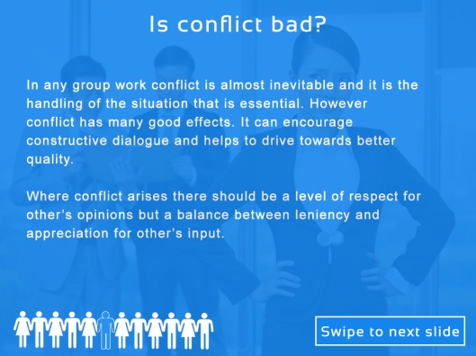
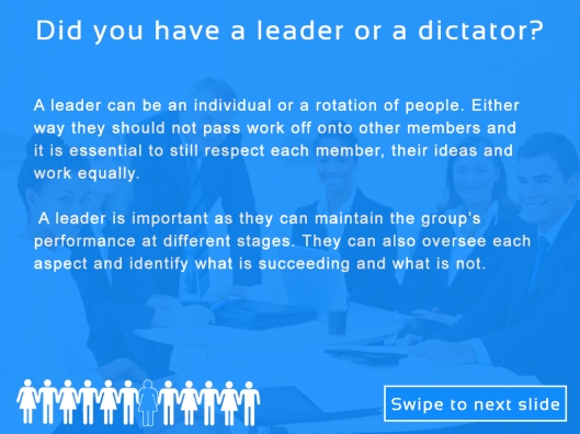
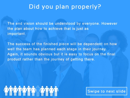
Since my last post I have updated the slides by making some amendments, mostly improving the language. I have also made the last two slides darker so the text is slightly easier to read. On the first slide I have also moved the images to the top and the logo and the ‘swipe to next slide’ to the bottom. This is to keep consistent with the design as before, the ‘slide to next slide’ jumped in position which caused unneeded confusion and distraction. The other noticeable change is changing the order of the “Think” and the quote slide. This is because the slide that asks the user to think is more affective after the main content. This way it asks them to think about what they have just seen whereas before it was asking them to think, but about what was unclear.
In the project statement (28/02/15)I stated that I was aiming for an average of 41 words per slide which would coincide with the average reading words per minute (WMP). However the total has come out at 46 words per slide. Whilst this is higher I had initially planned for 41 which was lower than the average reading WPM and so I think going slightly higher will have little to none impact. The important thing here is that the content had enough detail to make strong points which I feel I have done very well. Therefore 46 words per slide is still a good return and is justifiable based on my research.
Also, I was aiming for an initial Fog Index of 11 which has been achieved. My final score for all of the slides content was 11.05 (shown below).
I think overall I have achieved what I wanted to very well. The initial idea was to inspire reflection and to get users to think about how their group working experiences are very beneficial. I feel that I have established a strong body of ideas that are presented well with an easy and informative introduction and effective conclusion. I also think that the design is quite simple but the colour choice and use of graphics is effective and in tune to the theme of discussion. So in conclusion I am happy with the final outcome of my project.
Export Details and distribution
The slideshow will be available to use as both a ppt. file and a pdf. file and will work by swiping downwards to each next slide. Both ppt. and pdf. can be used on mobile and tablet devices and work well with no lag or performance issues.
The intended distribution methods of this slideshow would be either through app markets, or available to download as it does not require an app to open itself. However it can also be emailed and downloaded from a webpage or intranet service. For example after a student has completed a group work project they would then receive the slideshow to look at via email or download it from their institutes intranet service available to their students.
A Screen Cultures Artefact
Screen cultures is very much concerned with the ideas and practice of a lot of different diverse areas into media and also, the ability for those things to congeal` and link to one and other. Therefore As a Screen Cultures student it is my interest to be able to work with other people who have a particular interest or area of specialism where their skills could benefit my own work and verse visa. As a discipline, Screen Cultures provides great motivation for working with others and collaborating and so, this slideshow I would argue is very applicable in my area of study.


